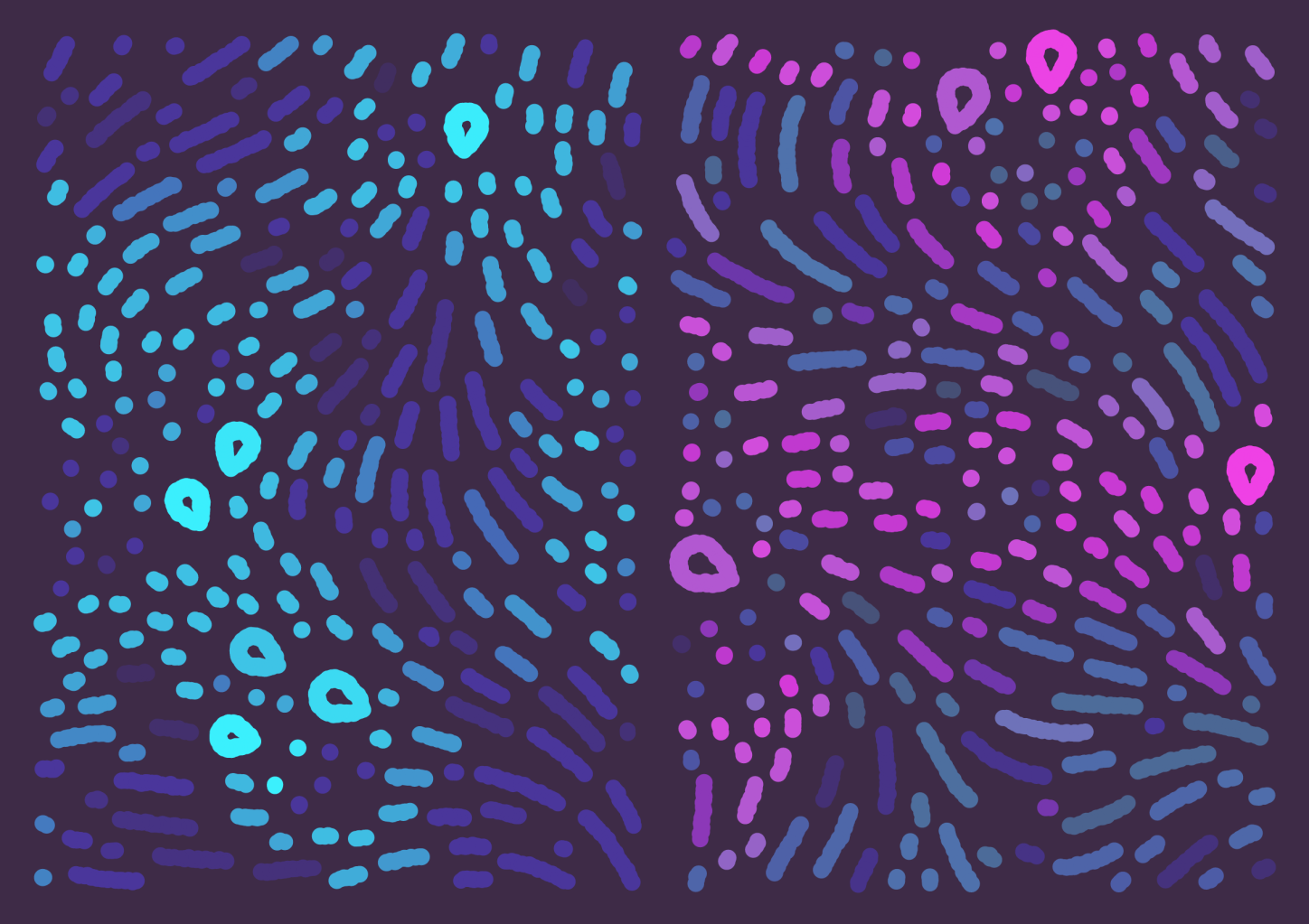
Maps for grief is a generative art project, published on the Art blocks platform. It explores the notion of togetherness without contact. As with most series, I find it ties together many projects and techniques I've done in the last two years. Let's look at a few of the building blocks behind it.
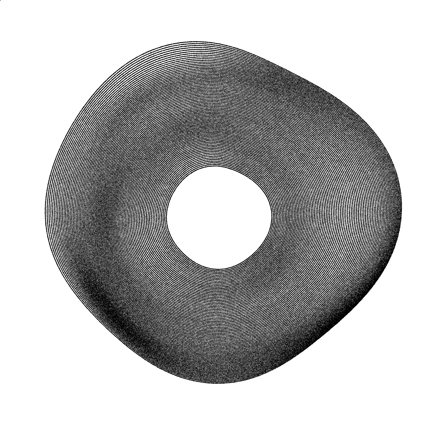
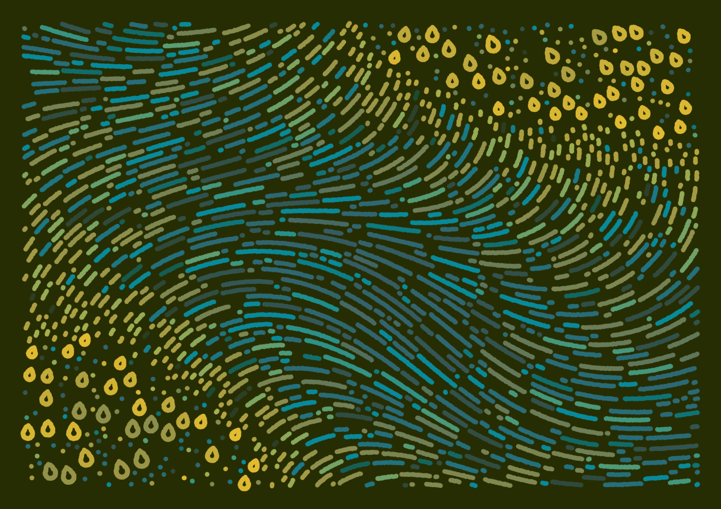
It released on January 11th, 2022, and minted 500 pieces. You can see the project on Artblocks here. The above image is test mint #12 on the Ropsten network.
Convergence
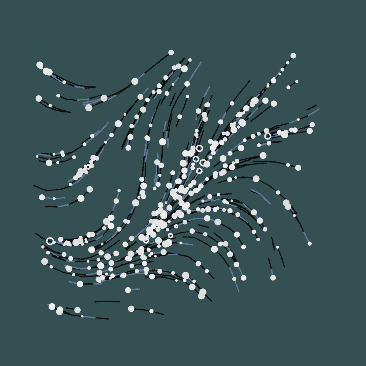
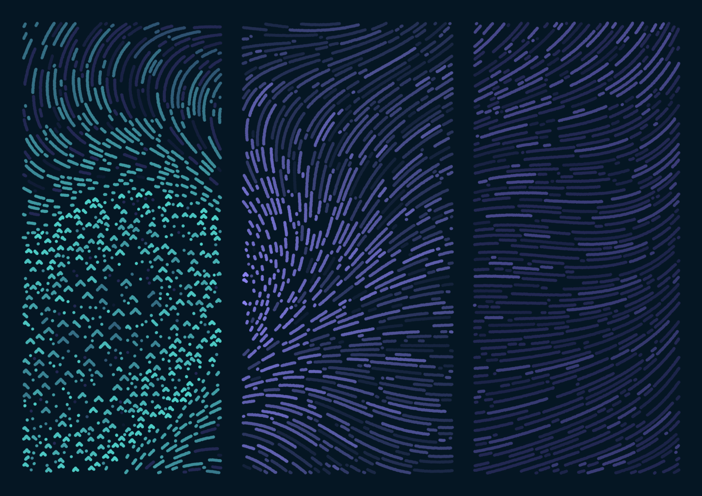
One of the first generators I've made and deeply liked is called Convergence. It uses a simple flow field to create undulating clusters of lines, then peppers them with small blooms of circles.
It's the result of several explorations on flow fields and branching graphs. Eventually, it became the foundation on which I created Maps for grief.
Glitches
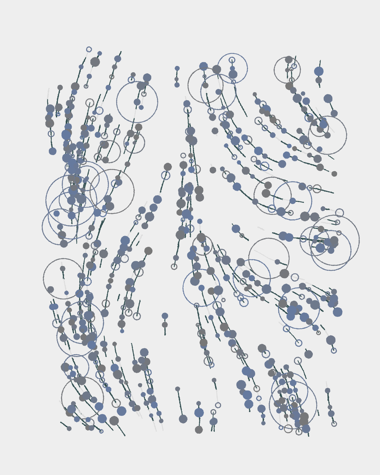
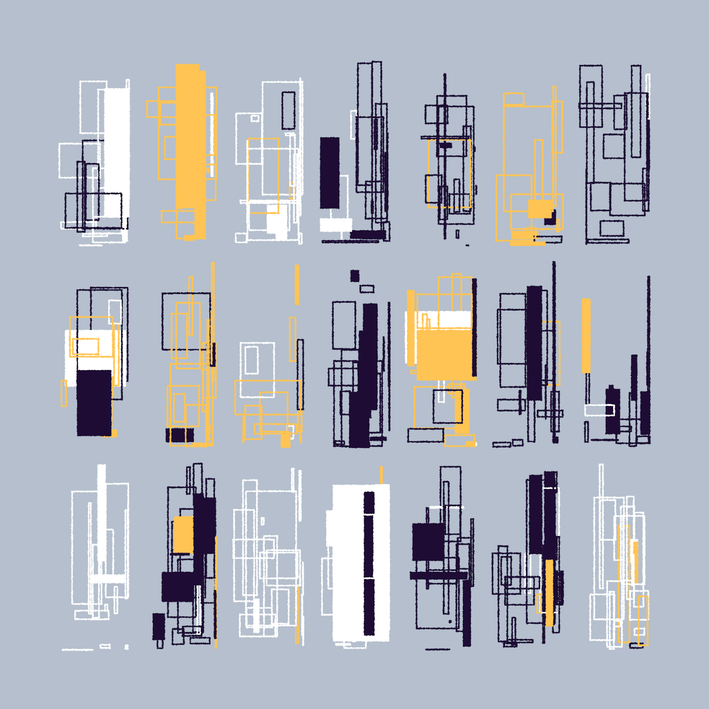
The idea behind Convergence's blooms comes back in a lot of my explorations, where I tend to establish a certain structure in the piece, then add odd parts that are less conforming to it. Internally, they're usually called glitches or anomalies.
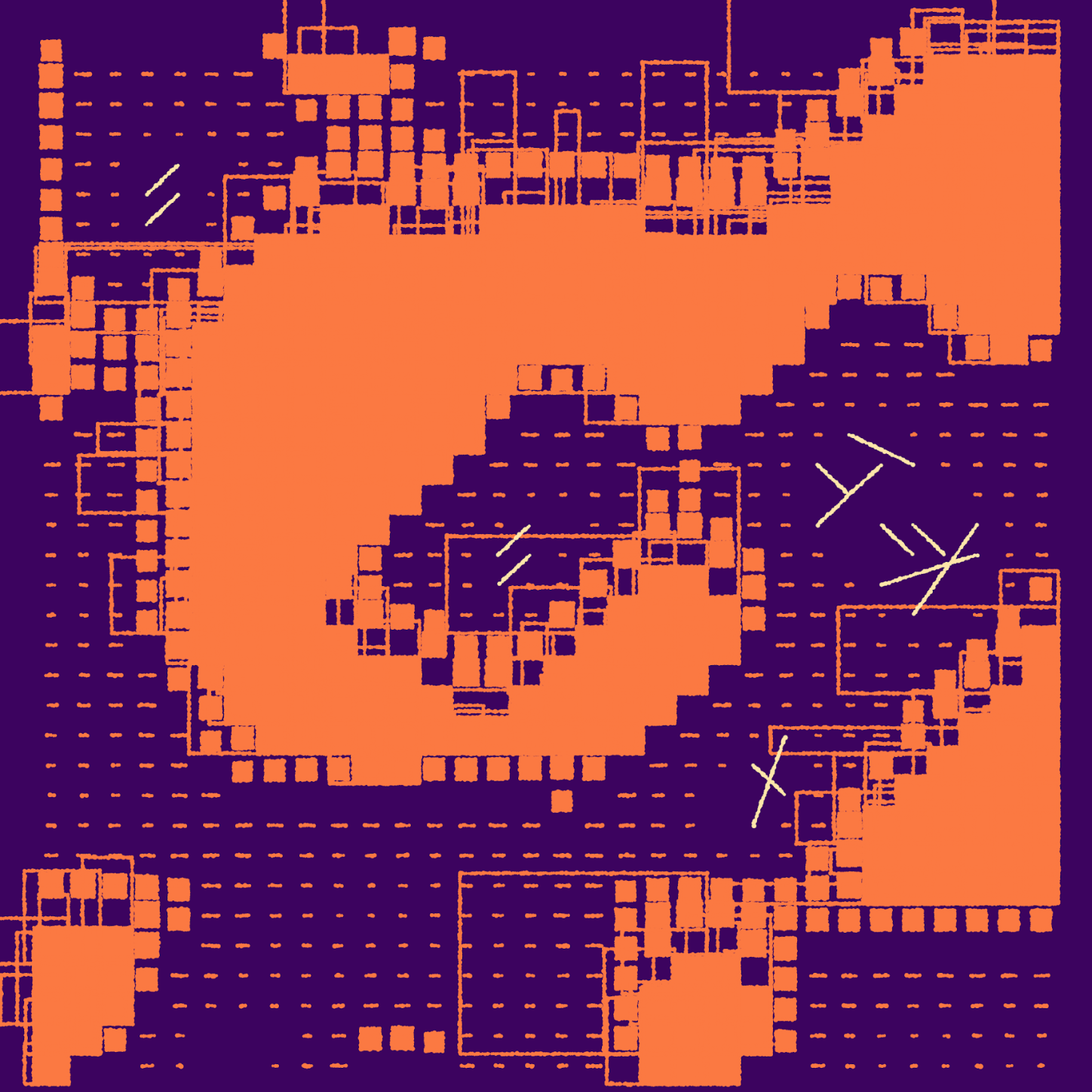
Sometimes the anomalies themselves become the main subject for the piece, as is the case with Glitch circles.
Other times, they bring variety and interest into a structure that would be too rigorous or monotonous on its own. The following was an exploration of purely using anomalies, turning a simple composition into something interesting by inserting "mistakes" in the drawing process:
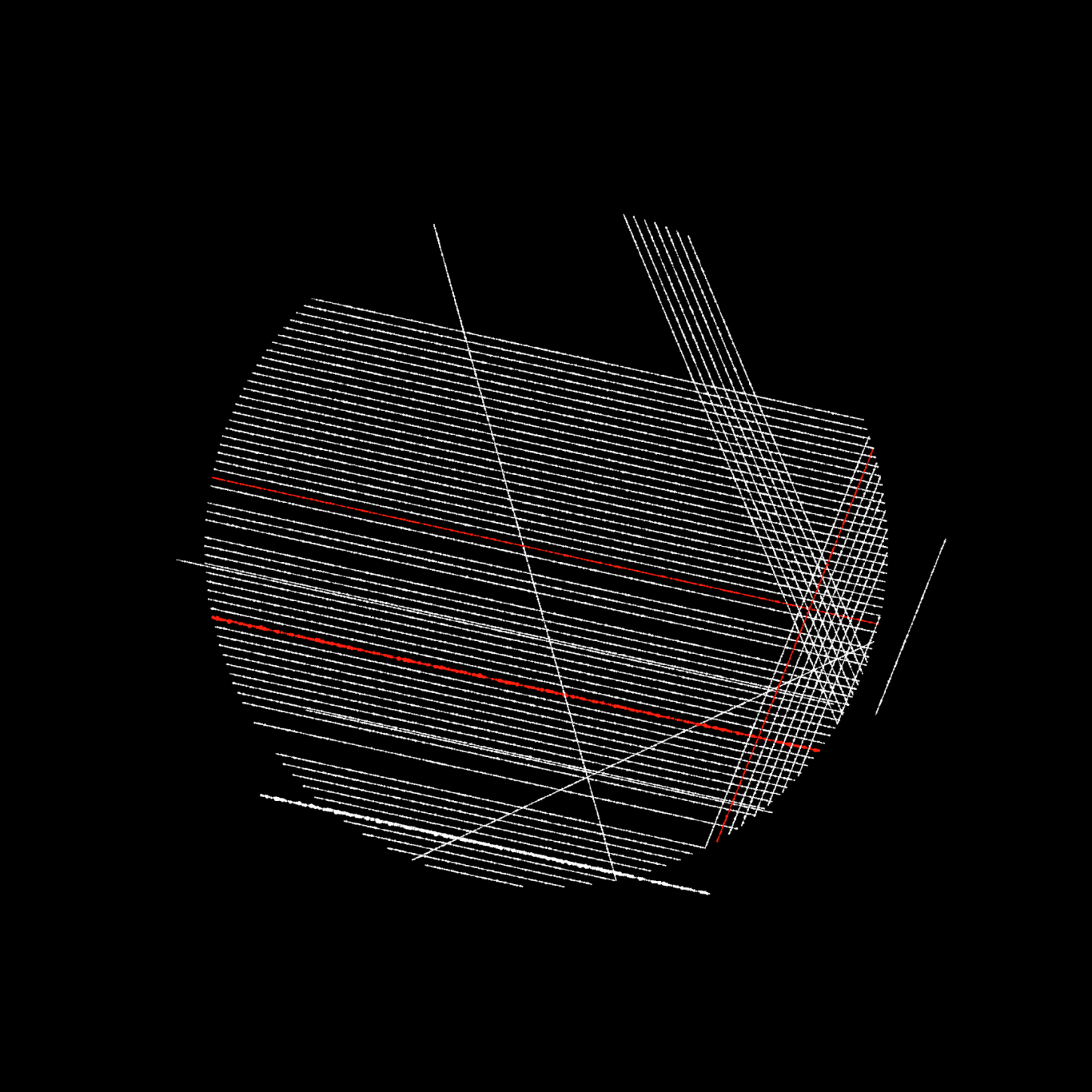
Maps for grief rests on the same technique of creating, then breaking, a given composition. At its core, each iteration tries to draw lines that flow side by side and never touch. However, these lines run into areas that dry them out, and force them to shorten, sometimes turning into clusters of anomalies when the secondary force is strong enough.
Topography
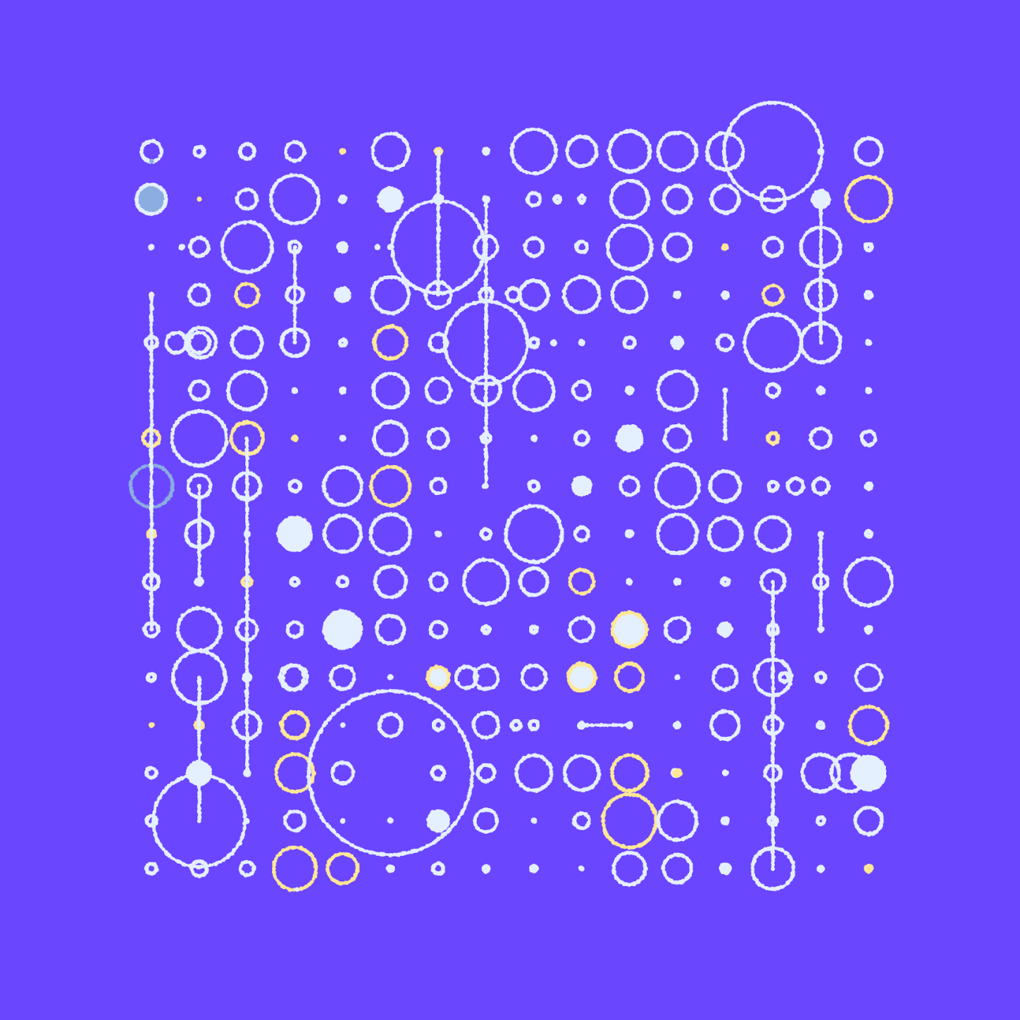
Architecture and natural structures are among the influences I can see repeatedly in my work. While they can be seen as competing aesthetics, I find that disciplines like urbanism and cartography have built a vast repertoire of work that reconciles the two.
Maps for grief leans heavily on a more flowing, nature-like composition, yet it inherits a lot (visually and technically) from explorations like Urbanisms or Boroughs.
Pen-like tracing
Early in my generative art explorations, I started building a plotter-like library to trace lines in an organic way. It's nothing very fancy – it follows basic lines and shapes, and sputters along the way, resembling what pen ink would do on rough paper. You can find deeper explorations on the topic over on Sighack's Fifteen ways to draw a line. Over time, the rough line style became a recurring part of my practice, and it's now uncommon for me to build sketches that don't feature this kind of hand-drawn quality to the shapes.
Maps for grief includes an agressively minimized version of the technique – at the data level, each iteration is distilled down to a list of colored circles, which are then traced on-screen to form the lines and shapes. The small jitter is part of the drawing routine, which is why it's possible to make the sketch gently animate without updating the data (press a on the keyboard when on the live viewer).
Quick notes on the long-form format
This is my second-ish foray into long-form generative art, a term coined by Tyler Hobbs to describe generative art that is created for direct distribution (the generator script is part of the art being delivered to viewers) and uncurated generation (the collector and the artist both discover what a specific iteration looks like at the moment it is sold and created).
The benefits and constraints of this form have already been discussed and laid out by others including Tyler, so I will simply talk about what I resonated with while building Maps for grief.
Subtle variations, less variability
The necessity for all long-form outputs to remain above a certain level of quality means that there is less of a "conversation" between the artist and the possible outputs at the end of the project. When manually curating runs, I can tolerate a certain rate of "failed" outputs that are either uninteresting or too chaotic and wild. With the tolerance afforded by manual curation, I get to explore a wider range of these possible outputs, including the interesting extremes, the good middle-ground. While I can keep the interesting extremes, at the same time, I get to discard the uninteresting extremes. With uncurated generation, all variability has to be constrained into a "good middle" instead. Which leads us into the second point:
This work requires a different kind of critical view
I found the project hard on my perceived critical sense as an artist. When judging curated series, the quality of the series is defined by the best iterations, which I pick out manually. Over time, this work accumulates as a corpus of past series, each of which remains represented by the best iterations I selected from it.
As I explore and build on previous work, the level of quality I refer back to is this running average of the "highs" from each project. Consciously or not, I weigh each series against it.
With long-form art, the series' quality is suddenly defined by the average of all its iterations, and how remarkable the best iterations are, and how "uninteresting" the least interesting iterations are. It's been difficult to recalibrate my perspective on output quality until I could bring the variability and features to a good place across the board.
Some example outputs
Here are a few iterations I shared from the Ropsten (test network) mints.
#22
#14
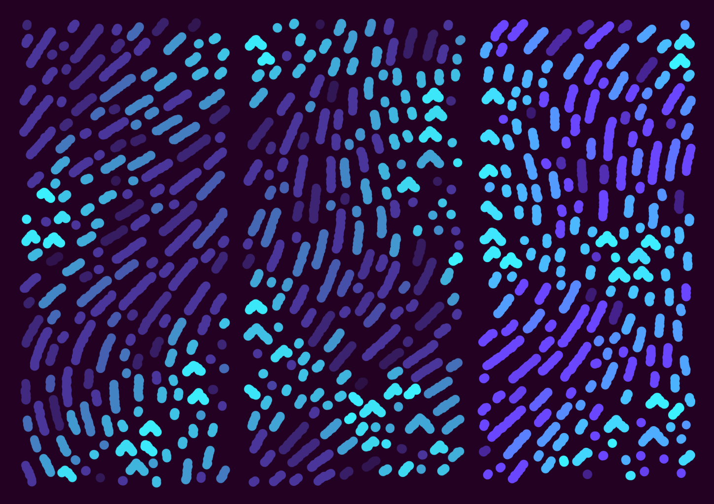
#11
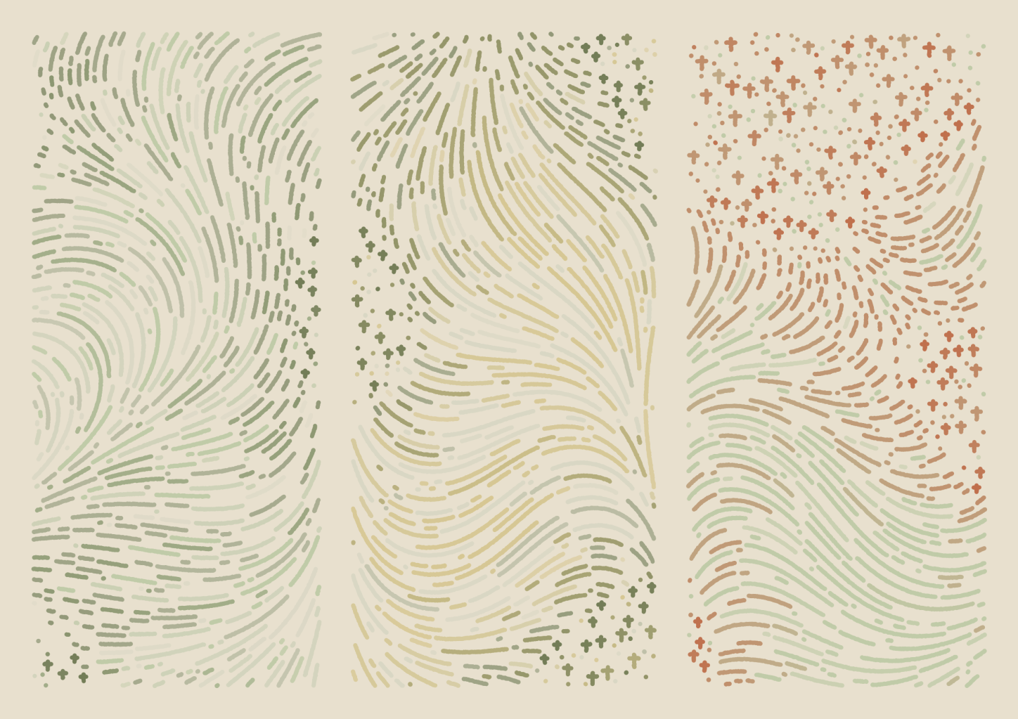
#34
Technical and rarity breakdown
See the technical breakdown here, in my follow-up post.